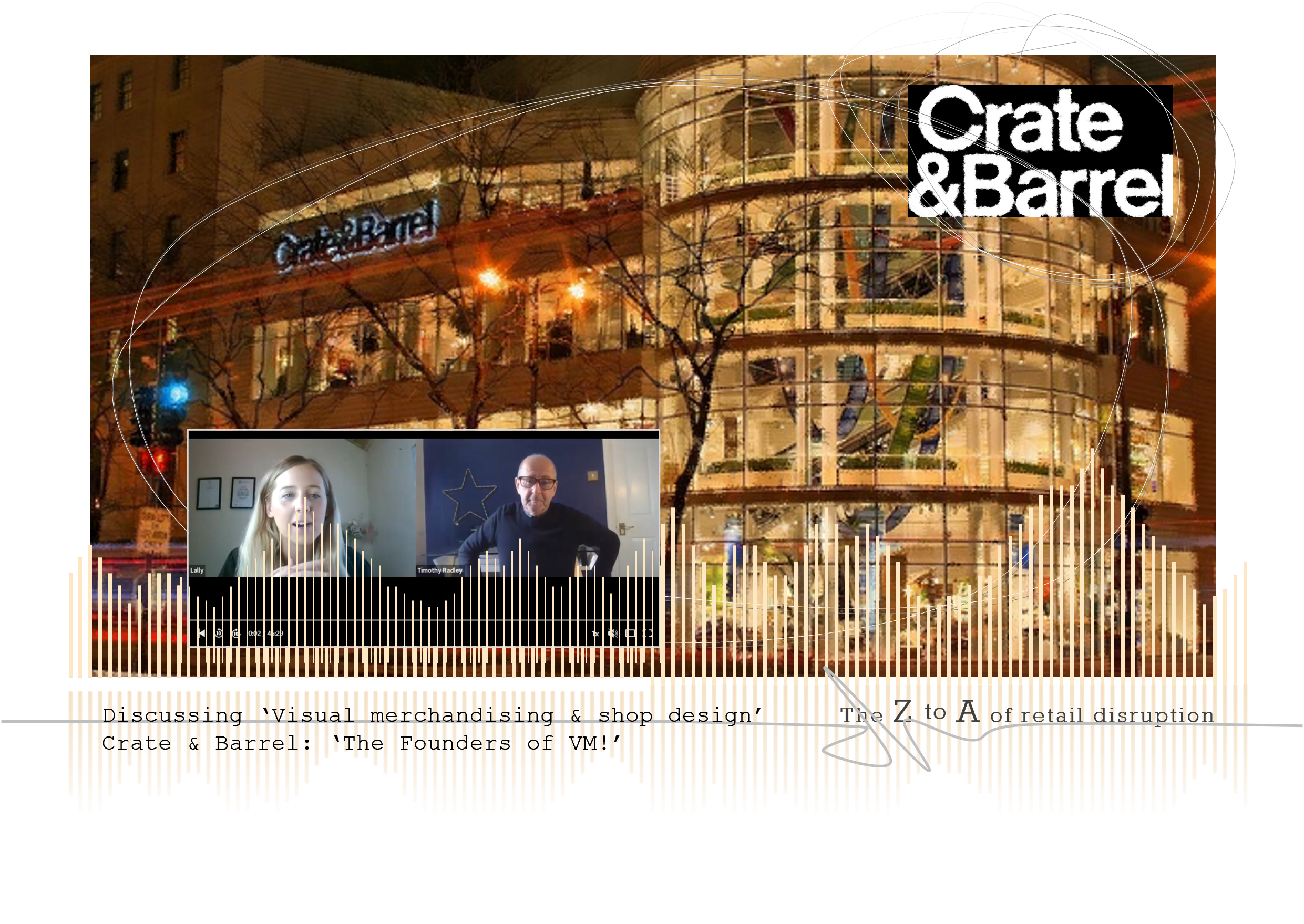
Listen to myself, Tim Radley, on the Louise Lally podcast, discussing the future of visual merchandising, and the changing world of physical shop spaces for both large brands and small independent retailing.
The podcast features a discussion on Crate & Barrel. For me their name and visual merchandising are synonymous. Visiting their famous flagship store on Michigan Avenue, Chicago was always the highlight of any trip to the US, particularly at thanksgiving through to Christmas. The store was written into retail folklore. It was the first Crate & Barrel. And it is said that the fledgling business were so short on cash after agreeing the lease, that they had none for fixtures, so they used the ‘crates and barrels’ used for shipping.
Crate & Barrel turned visual merchandising on its head, because they were at the forefront of ‘buying for space.’ What this meant was that the shop was split into linear feet blocks and the buying team then populated this with products. Whilst commercial performance was behind each selection, the team created beautiful and balanced displays that complemented each other and told a story. This end-to-end visual process ensured consistent and beautiful displays across their estate, made implementation and maintenance efficient and fast, allowed visual merchandisers to focus on being creatives and not managers, and it drove sales.
The art of storytelling was fine tuned to an artform. It was devised and implemented by throwing intelligence and not money at the shop. True to their Crate & Barrel roots, the brand used black text on white to literally tell stories. They used words to create lifestyle pictures in the customer’s minds, the relaxed Sunday afternoon by the fire, a popcorn party for family & friends, the best ever Thanksgiving table. Words complemented ‘buying for space’ and wonderfully coordinated product displays.
So, take a listen to the podcast, discover Crate & Barrel possibly in a new light for you, and understand why they have a very strong case to be called the founders of visual merchandising.
I’ll also explain and illustrate with best practice examples, the important areas that all retailers should consider when planning their shops, from the floor layout and space allocation, to grouping of product stories and visual merchandising displays.
Topics in the interview include:
- ‘Who were the mercurial brand that invented Visual Merchandising?’
- ‘How should we use colour as part of visual merchandising?’
- ‘Understanding the importance of lighting in shop design & display!’
- ‘The 4 different types of product stories we can display!’
- ‘How ecommerce has revolutionised the stories behind products!’
- ‘Is there less creativity in retailers, or is it simply focused on new and different disciplines?’
- ‘How is shop layout changing in today’s shops?’
- ‘Is space management still so critical? Do we need to put as many products in our shops?’
- ‘What KPIs do all shops need to measure to see if VM is working for sales?’
- How to prove visual merchandising works?
This is the second of 4 exclusive interviews Tim is giving during October. Other interviews cover:
- ‘Experiential Retailing’ & Shop concepts
- The new world for Retail people
- Sustainability & ethical retailing
