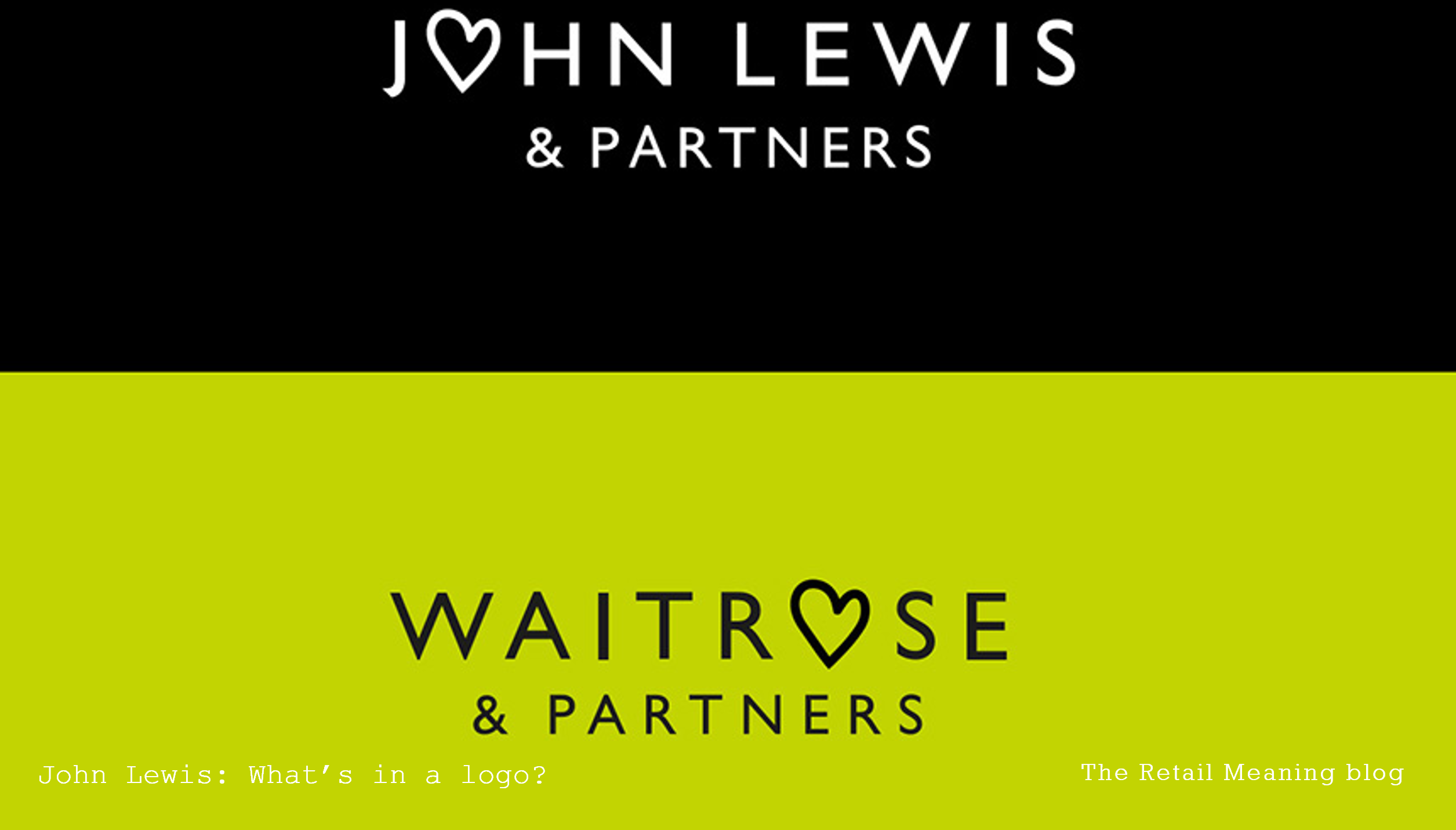
So, John Lewis has dramatically unveiled to the world the delivery of its new strategy. A variety of channels, most noticeably a glorious new TV advert, bring to life the retailer’s desire to create an unparalleled customer experience based on its services and the historical strength of its people – or partners.
As part of these ambitious initiatives it has rebranded and created new logos and identities for both the John Lewis and Waitrose chains. Sadly, but predictably, a large proportion of the popular debate has centrered around these new logos.
A sense of proportion
Now, whether you like a visual identity or logo is largely subjective. “You don’t create friends without making enemies” applies very much to visual branding. Also, people generally, and particularly traditional customers such as those of John Lewis, are resistant to change. They do however tend to forget their initial prejudices quite swiftly, if the more important and wider elements of their brand experience are positive.
Identity is only skin deep
Unfortunately, the focus on logos has veiled the significant and visionary strategic changes that John Lewis is putting into motion. It is radically evolving its assortment and revolutionising its fashion to achieve own brand penetration of over 60%. It is empowering its store teams to engage with customers in innovative and exciting ways. It is developing store designs and experiences to generate loyalty and patronage.
Ultimately it will be the combination of these wider issues that will dictate the future of John Lewis. It really should be commended, and hopefully congratulated on such bold moves. Its change of logos will be accepted and forgotten.
Beauty lies within a business
The salutary lessons are there. BHS dramatically changed its classic logo for a signature script and then to a dreadful incarnation shortly before its bankruptcy. Had it invested in its core issues rather than its look then the outcome may have been different.
Equally, would anyone seriously say that the solution to the woes of House of Fraser or Debenhams lay in a new visual identity.
In fact, many successful brands have rather anonymous logos. Not many would be able to identity the fonts or brand colours of such vibrant retailers as Zara or Topshop.
Smart retailers, watch and learn
So, let’s not get too hung up on logos. The new John Lewis and Waitrose identities may not be the best designed, but they are not inappropriate for the brands and the values that they represent.
Smart retailers pay attention to the evolution of the John Lewis assortment, its omni-channel leadership and services. Smart retailers take a lesson from the boldness and vision behind the new initiatives.
Smart retailers listen and learn from John Lewis.
