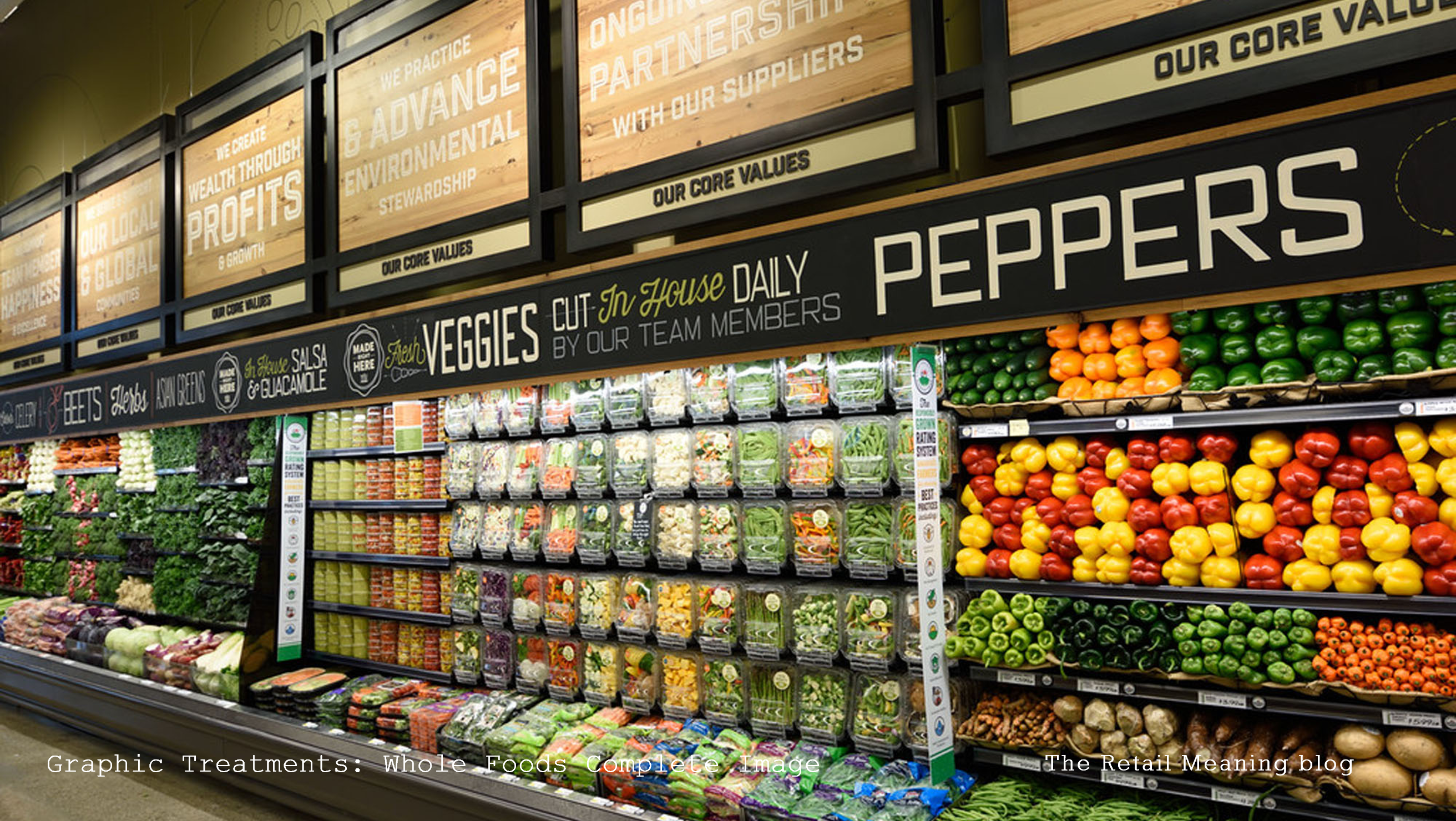
Even when you’re famous and frequented on a regular basis it does no harm to constantly communicate what you’re famous for, or indeed what new treats and delights you currently and continuously have in store for your adoring advocates and visitors.
Dynamic graphic communication which is both in brand but constantly relevant and ostentatiously spontaneous is not an easy balance to achieve yet Whole Foods succeeds with style and taste, coordinating permanent navigational signage with service messages, product information with health advice, seasonal event communication and dynamic product promotions without reverting to the stale stereotypical use of colour spectrums so often adopted to differentiate messages.
At the core of this careful delivery is the combination of product display with graphics, so often neglected when graphic design is dealt with in isolation from the assortment and the real store environment. Consider a barrow of bananas with themed signage, a plethora of panetone with organic information or a mountain of cheese with mouth-watering recipes and benefits.
It isn’t possible to talk about everything in a store, all at the same time, particularly for an operator like Whole Foods with so many things to say, but with careful planning of time and space, bold combinations of graphics and display and an attention to graphic design detail, a retailer can continuously live and breathe for its customers through the messages its makes and the stories it tells through time.
Are your store graphics telling the right story for you?
Do you create confusion with a blur of fonts, or sterility with colour control?
