Apple: a business designed on simplicity
The best advice I ever received in Design College? Keep things as simple as possible.
The temptation always when seeking beauty through design is to add more ‘beautiful’ elements to it. In fact, the way to design beauty is to be brave enough to remove as much as you dare to reveal the absolute beauty of simplicity.
I’m sure that Apple needs no more of an introduction than that.
Personally, I would say that Apple has as close to a perfect proposition as you are ever going to get. The brand values are written through everything that the customer ever experiences with them, from hardware to software, colleagues to shops.
Those values were of course originally written through the DNA of its founder Steve Jobs. He was the living incarnation of the precision and simplicity of the brand. And he found his soulmate in the form of Jony Ive, who interpreted the beauty of the brand into the simplicity of the product design.
So much for beautiful beginnings. So much for a simple proposition, but what about growth?
A brand untainted by growth
Growth has not tainted the Apple brand or stretched the proposition into unfamiliar shapes. Firstly, because the values have not been ignored, and secondly because the assortment has grown slowly and organically. In fact, it can be argued that the brand values only strengthen as every faithful addition to the product portfolio takes its first bow.
We can see how everything comes together as one physical expression when we visit one of their flagship shops. It is easy to take them for granted now, even after such a relatively short period of time, but we should not forget the adoration and admiration that greeted ‘another Apple revolution in retail’ when they unveiled the glass cube at the top of fifth avenue.
What an entrance, in every sense, to a new world of retail. Retail spaces were re-invented at a stroke. The brand DNA of Apple built into the fabric of the shops.
A celebration of simplistic architectural design
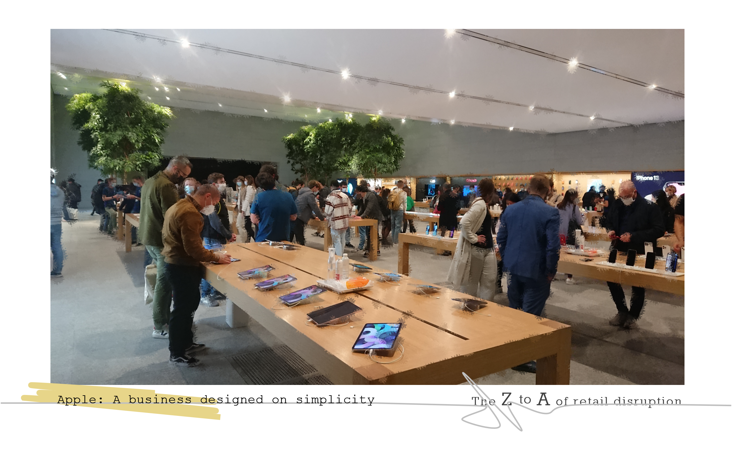
We see simplistic environmental design reflecting the design of the products themselves. We see the evolution of the large table as a display and practical presentation solution, just like the product interface. Incidentally, for those that don’t remember shops before Apple, the product went on the walls, accessories hidden on the floor. There were no tables. The use of the large floor table revolutionized retail design thinking for many businesses. Apple re-purposed the table in the retail environment.
We see the conformity, reliability and expertise in the shop colleagues, participating in organised presentations, personal demonstrations and casual conversations. Always available, working calmly under pressure, just like their products. We see a high volume of expert colleagues. We see customers immediately served, no waiting, no impatience.
And what we see are huge communal spaces, packed full of bustling people, whilst remaining comparatively empty of product. We see customers at peace in the simplicity, within the cavernous reassuring space that is Apple.
The success of its proposition should be measured in the densities of the shops. The product option per square metre density is one of the lowest in the world, only beaten by car showrooms, and luxury ones at that. Its customer density per square metre is one of the highest. Decidedly higher than any car showroom.
Apple’s proposition is huge, its assortment is small. Both are simple, beautiful and desirable. A price worth paying.
Shops busting full of bustling admirers lay testament to that.
‘Apple. A business designed on simplicity’ is an extract from the book ‘Meaning in the Retail Madness: How to be an Essential Retailer.’ by Tim Radley.
If you would like to read more about the new ways that retailers are working with their brands and product ranges, streamlining their assortments and aligning all touchpoints behind one customer proposition, then you can find all of this and more in ‘Meaning in the Retail Madness.’
