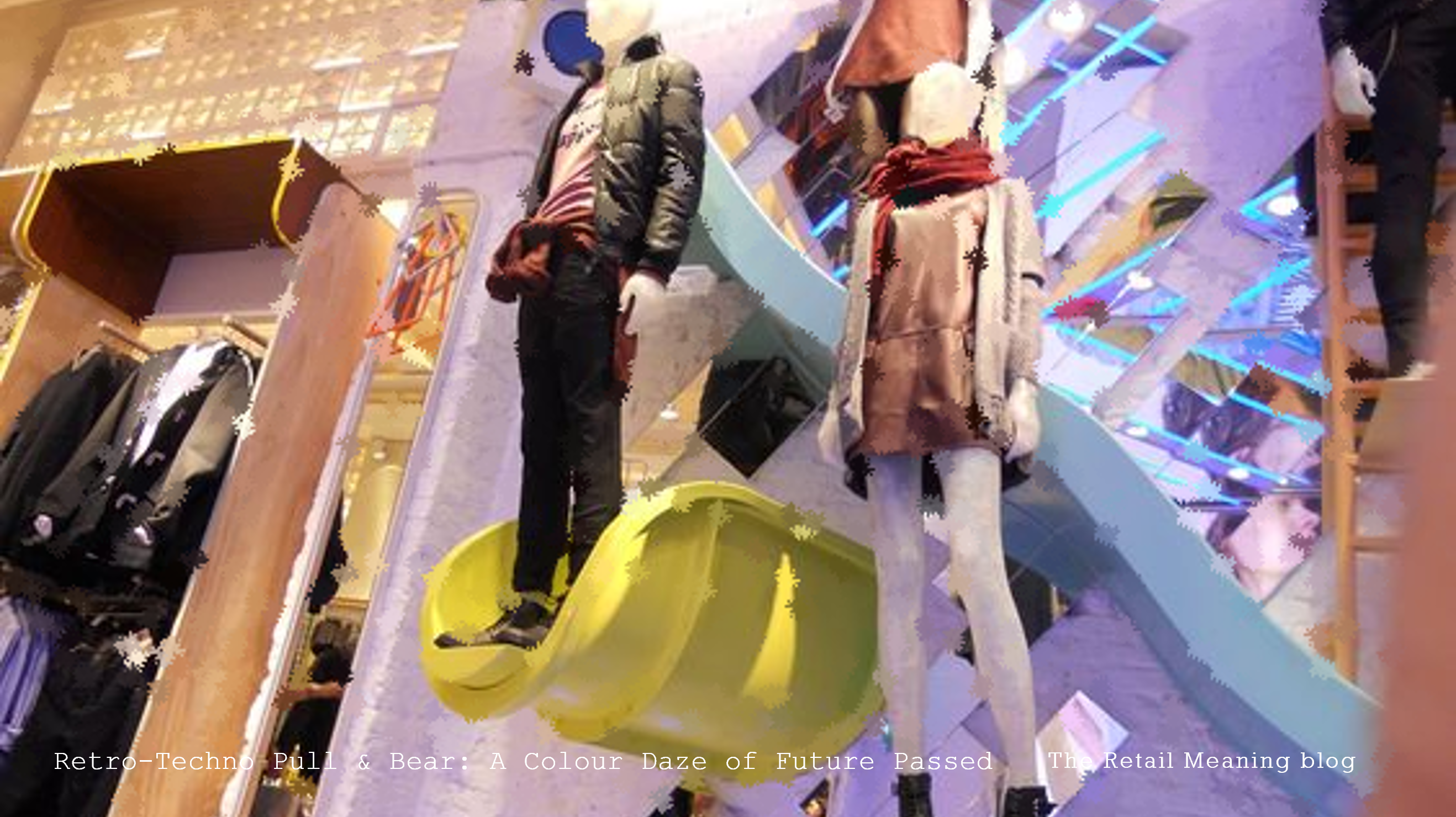
A colour, graphic explosion lights up the latest store incarnation of Pull & Bear, the young casual concept from Inditex.
But this is no blind leading the colour blind, no random application of hues and tones to randomly revive a fading friend. In a very cool but classic way Pull & Bear has combined the innocence of classic times with the dynamic technology of today.
Imagery abounds from the fun of the fifties with retro posters in glorious Technicolor saturation, and then adds the complementary neon highlights from a thousand timeless fun fares and fairground attractions to create a space of life and fun.
New technology is integrated in a subtle sympathetic way not clashing but complementing the simplicity and naivety of the bold shapes, spinning circles and shining stars. Its value is in the dynamic changes it offers the stores from seasonal backdrops to promotions and hero pricing. The low resolution, large pixel delivery is deliberately dumbed down to fit perfectly with the show-time signage throughout the store.
This is technology taken from Lefties but exploding centre-field to transform Pull & Bear from a moody moribund teenager of a concept into the fun-loving, life enhancing brand now bursting onto a street near you.
Are your graphics centrepiece or peripheral to your store experience?
Are you harnessing the dynamic opportunities offered through in-store technology?
